Oh Boy, a Contest!

I sell my designs mostly on Zazzle. They run contests every now and then for their designers. It’s a nice touch, but I’ve only entered one before. The current one is called Moments.

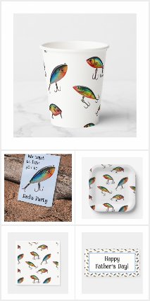
I recently took my car in for inspection and while reading magazines waiting, there was an article about fishing [it’s a mechanic’s shop, not a wide selection of magazines] with pictures of fishing lures. They’re awesome. I used to look through my dad’s tacklebox at all the cool lures. With Father’s Day coming up, I thought a party themed with fishing lures would be great. Then I thought it must have been done a thousand times before, so I looked up ‘fishing party’ and the results were horrible! Fake, childish, fish decor. All of it. So I set my plan in motion.

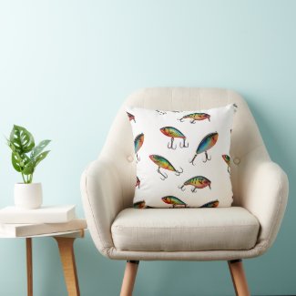
I got a bunch of fishing lure images and manipulated and arranged them to make a pattern.


Then, I went crazy and put it on every party thing I could think of…


I’m sure I’ve missed a few things… Maybe I’ll put that main lure – the one on the card – on the icing rounds. Those icing rounds can go on cupcakes, or around the edges of a cake, or even on cookies.

Probably the worst part was the mockup. I’m not very good at that, as you can see by my cover image in the Fishing Lures collection. Yes, I remembered shadows, but I’m still not content with how it turned out. But overall – I’d much rather give a fisherman a party with real fishing lures rather than comical, childish fish.

My dad passed, but he was big on fishing. I’d use these for him. That’s who I had in mind when I made them. Hope you like them too.
My Distressing may be Distressing

I use an old graphics program that I own. I don’t ‘rent’ it. I own it. It’s mine. It’s Paint Shop Pro 7. There are a lot of things I can do with it, but many of them would be easier with a newer program. I understand that, but I’m not renting a program. This post is about how I distress designs to get that vintage look.

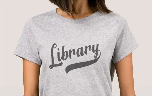
I was at a store recently and saw a guy with a shirt that had one word in a ‘varsity’ style, but I couldn’t seen the full word because he was wearing a jacket. It didn’t look like a team name or school name – it looked like it said ‘chocolate’. I thought it would be cool to make a varsity style design that wasn’t for a sport. I wanted the varsity style font, definitely a tail [or swash – that long part that goes under the word] and a distressed look. I chose a font called Fenway and some swashes to go along. I made the word Library, then started distressing it.

To distress, I have a few distressed backgrounds. You can usually find free ones easily through a search and just decide how much distressing you want. You do need layers to distress the way I do.

With your design on one layer, copy the distressed image file you’ve choosen, then start a new layer, select all, and paste the distressed image into the selection. Use a colour selection tool and hit a colour in the the distressed image, then find your selection tool and modify it to ‘select similar’. See if that looks like too much. If it is, try again from using the colour selection tool. You want a small amount of distressed, so you don’t over do it.

Once you have a good amount, switch to the main design image and cut. Is that enough? If you need more, move the selected section around and cut here and there until it looks they way you want.

Random Varsity – Library

library shirt

Here’s a close up:

That’s how the distressing works.

Might be easier if I wasn’t so set on owning a program, but not too hard.

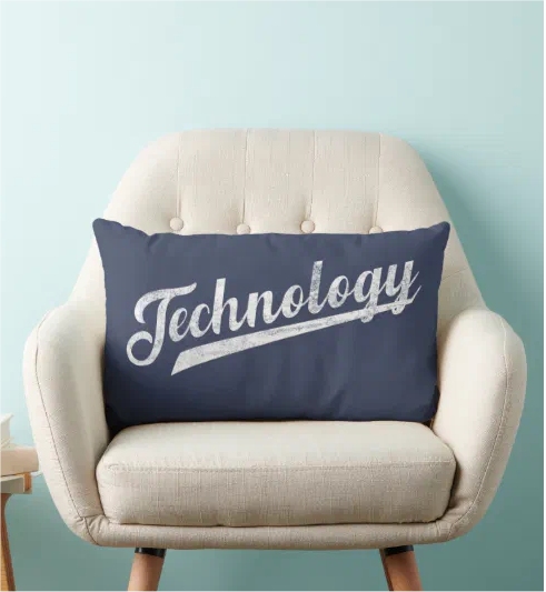
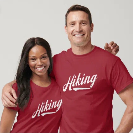
Other Random Varsity designs on Zazzle:

Almost Like a Shadow

Who doesn’t love a silhouette? They stand in place of something and can be nothing or everything. They can be a void to be filled, or a stark reminder of an absence.

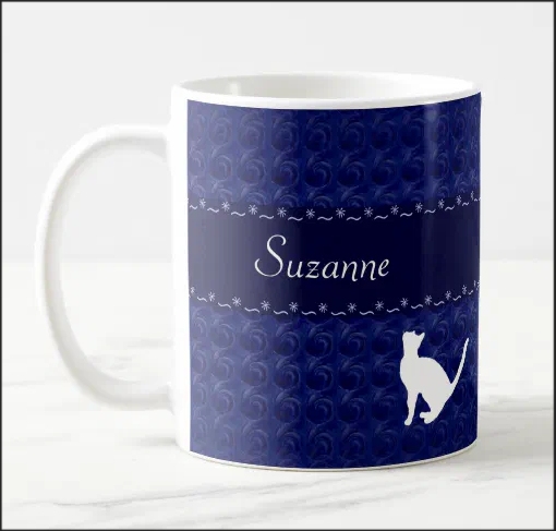
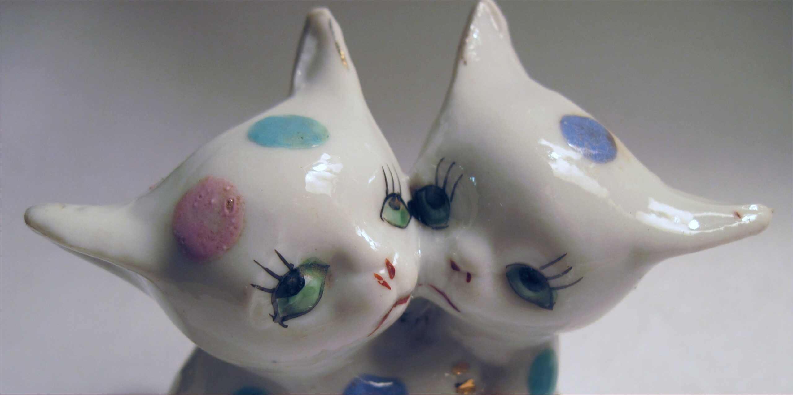
I’ve used silhouettes a lot in my designs. I have cat silhouettes:

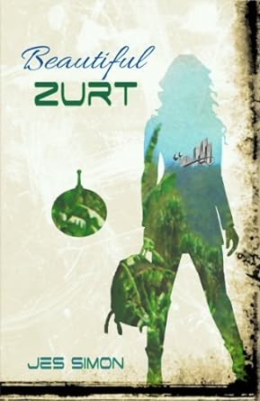
I have a store on Zazzle that is all silhouettes. It’s called We Have Cookies – a ‘come to the dark side, we have cookies’ reference. I even used a silhouette on my book cover:

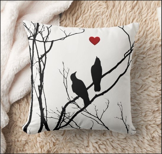
There are a lot of places to get silhouettes online, but you can make them yourself. I took a picture of some birds at the top of a tree. Luckily, the lighting was perfect. All I had to do was turn up the contrast and – boom! – a silhouette.

If you have any object or person with a light background, it can easily be a silhouette with some contrast and maybe a little cleaning up. Use it as is, or fill it. You’ll need layers to fill it. With the silhouette on one layer, pick an image or design you want to fill it with. Put that as a bottom layer. Go to the silhouette layer and select the area and delete. The lower layer shows through, and you have a filled silhouette.

If you want the result to stand alone – png with a transparent background – with the silhouette area selected, go to the fill layer and copy and paste as a new image.

Silhouettes are fun and easy to use. They’re very, very versatile. Give them a try!

Gaming and Design

I play video games. There, I’ve said it. I’ve been playing for yeeeaaarrrrrss. Seriously. Started with a text multiplayer on a BBS in 1996. Because I play, I would love to design things for the games I play. Thing is, you can’t. Not really. Most everything is under some type of copyright or trademark.

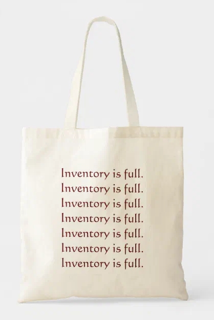
There are ways to make designs that are related to the gaming experience, without compromising the copyright. Take this bag for example:

If you’ve played World of Warcraft at all, you know the pain of this error. It means it’s either time to hit the Auction House or, oh noes!, delete things from your bag or bank. I have an Autographed Portrait of Jaina Proudmoore I’ve kept for years. And mats. So many mats I’ll never use. Hoarder? Maybe.

There are more WoW related gifts in this shop on Zazzle – Now Breaking

Recently I started playing Fortnite. You should try it. It is so well made and fun! Anyway, I had read that ‘older’ people don’t do well with it because their reflexes are shot. When they say ‘older’, they usually mean over 30. Being a bit [lol] over 30, I was pretty sure I would suck. Turns out, I do not suck. I’m pretty good at it, like, really good. I wanted to make a shirt that said, “I’m pretty good at Zero Build Solo”, because I thought it would be fun to wear – surprising. Nopeity, nope.
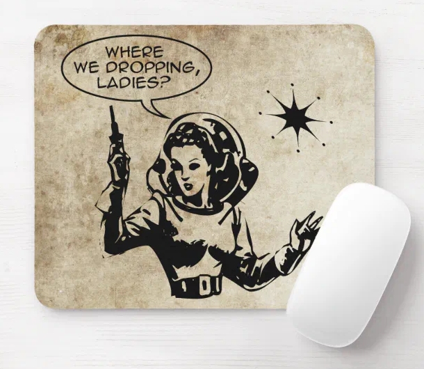
Seems ‘zero build’ is so Fortnite it’s not allowed. Well, not on Zazzle, because they’re very strict – which is good, as someone with a trademark, I appreciate it. So I made girl gamer things instead.

Here’s the link to the items – Girl Gamer Gear
I liked the mousepad so much, I got one myself.

Get it on Zazzle!

So, if you really like something, you can make a design related to it, just not with the name or logo in the design. When you’ve played a game a while, you know the inside jokes that would work, without encroaching on copyright. Play on, my friends, play on!

Quick Note on Stealing

I mentioned in a previous post how you can ‘steal’ inspiration from anywhere. Here’s a great example I came across yesterday.

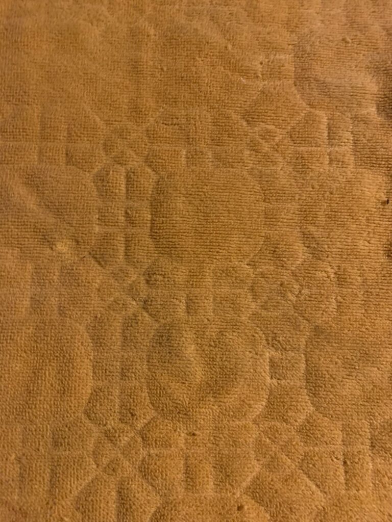
I was doing a clean out under the kitchen sink and pulled out a tray I use for dangerous chemicals. It needed a washing up, so I took it outside, scrubbed it down, and left it in the sun to dry. But, it didn’t dry. I guess it was too humid. So I brought it inside and set it on a towel to dry. When I picked it up, it had left a pattern imprinted on the towel.

How cool is this??

I will definitely use this pattern in the future! It will look nothing like the towel, but I’ll know where it came from – and so will you!

Look around. There’s inspiration everywhere!

My Monitor is a Filthy Liar

I always trusted my monitor. I calibrated it when I got it. The colours were right on the money. Or, so I thought.
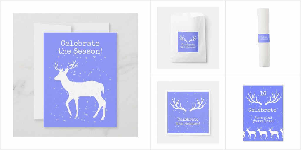
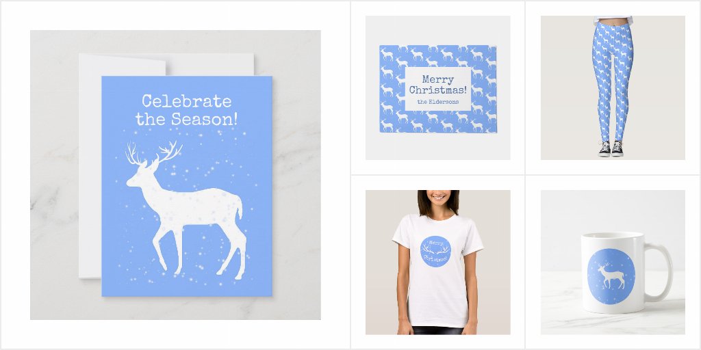
I was working on a design for Christmas. I decided to do something different. I would make a Christmas design in blue.

I picked a lovely shade of blue. In my head I was calling it cornflower blue, because it seemed to have a hint of violet in it. Just a hint.

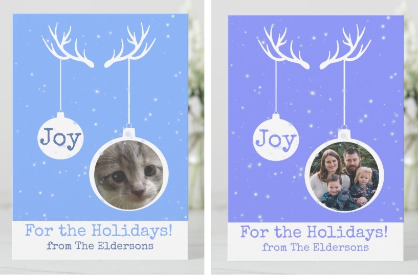
I went to Zazzle and added a bunch of products with my new blue Christmas design. Then, I posted images for my friends to see. The response was almost immediate and universal – ‘This isn’t blue, it’s purple’ I was confused. Of course it was blue. It was blue as blue. Okay, there was that hint of violet, but it certainly wasn’t purple!

To prove my point I went to my other computer and looked at the design. Well, darn and drat! It was purple!

Designs side-by-side
What I thought it looked like vs What it really looked like

Even with all the calibrations. Even though everything looked perfectly normal on my main computer. Somehow, my blues were off. I decided to name the design Oh Deer, it’s Christmas – Periwinkle.

Periwinkle Design

Then, I remade it with a true blue, checking both computers, and made an Oh Deer, it’s Christmas – Blue.

Blue design

Lesson learned. Never trust your monitor. Never ever.

How I Steal

I read a book a few years ago called ‘Steal like an Artist’ [Austin Kleon]. My main take-away was ‘be inspired’. I was already designing, and I know if I see a design I love, it’s better to buy it from the artist, because anything I try to make like it will not be half as good. It’s their style. I can’t do their style! But I also realized I can see a design and work off of what I like about it.

One of my first ‘steals’ was from a picture of David Cassidy. Honestly don’t know how I came across it. But… that shirt!

David Cassidy
Okay, looks like a credit pic – such a thief!

I wanted to create a design that was similar. It, of course, wouldn’t be the same. It was me, drawing with my magic pen on my screen, but it could give me the same feel of that design. I drew a bunch of tiny blocks with things in them [technical term – take note].

I put them all together and made this on Zazzle:

Primitive Pattern Messenger Bag

This was my first ‘steal’.

Get inspired. Find designs from the past, present, in nature, everywhere, and make them your own. Something that sparks for only you – or so you think – can become something new. You’ll have a unique-to-you design that others will love.